Using the HTML Button Generator
This guide explains how to use the button generator. You can generate buttons visually adjusting variables such as background color, border width, border radius, box shadow and more.
Once you are happy with your button design you can copy the generated code and implement it into your project.
The generator takes care of accessibility requirements, cross browser compatibility and mobile optimisation. It's basically the fastest, easiest and most fun way to design buttons and call to action for your website that 'just work'.
This guide explains how to use the generator. While it's called the 'html button generator' you can also refer to it as a css button generator because it provides generated css and html for your button design.
As You Design, Live Button Preview
As you design your button in the button generator, a button preview is created on the right hand side.
Whenever you make a change, the preview updates. We also save your button into our database of button designs so you can leave the generator and come back to it later.
We keep your button for seven days so if you want to keep it for longer, please create an account and save the button to your user.
Button Generator Style Properties
The Button Generator gives you loads of properties you can adjust to design a great button. When the generator loads, we randomly generate a button that has a nice design already and we know works well. This gives you a strong basis upon which to craft your own design or you can go ahead and just use the generated css and html provided.
Here are the main properties that the generator can help style:
Background Color
Background color can be selected for the four states of your button. Default, hover, focus and active.
Choose from a palette of popular background colours or define a specific HEX or RGB value. The transparency of your background can also be defined.
A combination of color and transparency settings can be used to good effect for hover states creating the impression your button is being pressed.
The css button generator will output css code automatically and defaults to using HEX color references. However, when choosing color, you can input either RGB or HEX and the generator will convert between the two.
Borders
The border of your button is the line around the content. It can be a different color or the same color as the background. You can also have curved corners, different border styles and thicknesses.
The generator makes it easy to visualise many border style combinations quickly so you can decide what looks best for your button. Border top, border right, border bottom and border left can all be edited individually.
This gives you the ability to visually define border width differently for each edge of your button. You could have a thick border on the bottom of the button for example. This can look great in your design, a bit like you have underlined your button.
Equally, the generator also lets you have different border radius (curvy corners) for each corner of the button. If you set the border radius to a very high number it eventually becomes a circle.
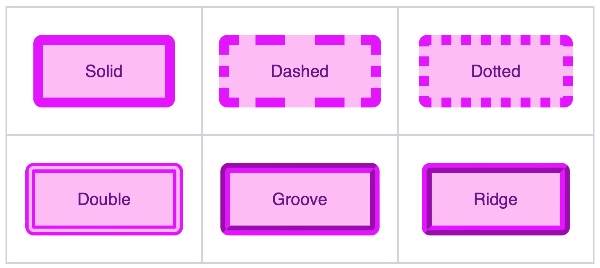
When it comes to border style, the css button generator features the main CSS border styles:
Dotted
Dashed
Solid
Double
Groove
Ridge
Inset
Outset
Finally, you are able to choose your px border color and define separate border colors for each edge of the button if necessary.

Icons
Great buttons have icons. Particularly when using as your call to action (CTA), a button icon can really help encourage that click.
With user experience in mind rather than conversion rate, icons can help provide a visual reference for the function of your button. 'Save', 'Next' or 'Download' work well as a combination of text and icon inside your button.
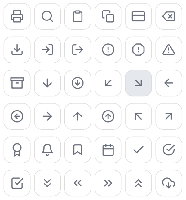
The button generator makes it super easy to add icons to your button text either before or after the main text content. Here is a sample of just some of the icons available in the generator:

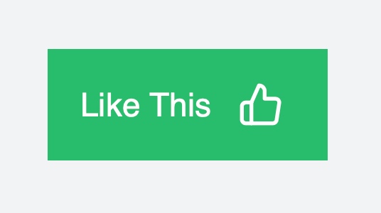
Here's an example button with a thumbs up icon on the right hand side:

Size & Spacing
Padding and margin create a sense of space and volume for your button. Getting the padding right is essential for creating a well proportioned button that makes it obvious what the user is clicking on.
Too little space inside or outside the button and it can be unclear to a user exactly what they are clicking on to perform their desired function.
Use the padding and margin sliders in the generator to adjust the spacing so you can quickly and easily assess the visual appeal of your new css button.
Alignment
The CSS framework that underpins buttons generated on this website offers a few simple classes for aligning your button within the containing div.
'Left', 'Right', 'Center' and 'Fill'. The classes are: btn-left, btn-center, btn-right and btn-fill. Simply choose how you would like your button aligned and the generator will apply the class as necessary.
Because the button lives inside a div container with styles defined by our css framework, the alignment classes will work pretty much anywhere on any page. The alignment will take effect inside the container and whatever available space there is for that container.
Font Color, Family and Size
Google fonts are built into the generator so if you're using a Google font family on your website you can use it here too. Define the font size and font weight first before choosing font style (italic, bold etc) and finally add text decoration.
The generator also gives you options for text color (across all states) as well as text shadow.
Type into the box the words you want to appear as your button text and experiment with different wordings such as 'Buy Now' or 'Download Here'.
Transitions
It is worthwhile making your buttons react to the cursor and when it does so you can use transitions to effect how your button changes from one state to another.
For example, changing from :hover back to :default (or vice versa) you might add a smooth transition over a few milliseconds just to smooth out your design and make it extra pleasing.
You can choose which properties you want different transition effects to apply to and you can define how long the transition should take place over.
Box Shadow
The generator comes with a box shadow tool for adding shadow to your buttons. Shadow is a great way to lift your button designs off the page.
Button shadow is a bit tricky code. Well, actually, it's really tricky to code in my opinion with horizontal length, vertical length, blur radius, spread radius, opacity and color.
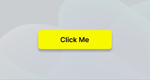
Luckily you can play around with sliders for these values and get the box shadow looking just right for your button, like this one:

The Generated HTML Element and CSS code
When you are finished designing your button, go ahead and copy the generated css as well as the HTML and put it into the code of your website.
We provide an underpinning CSS framework that you will need as well but once you've added this to your website, all of your buttons will work use these core styles and you'll only need to copy the individual button styles once.
Create high converting CTAS (Call to action buttons)
Creating high-converting CTA buttons is all about guiding users toward taking a desired action - whether it's signing up, making a purchase, or downloading a file. Effective call-to-action buttons are key to improving your click-through rate, boosting user engagement, and driving conversion rates on your website.
With the generator, you have the tools to design your css button that not only look appealing but also encourage users to interact. The generator’s options for customisation, like color, font, icon inclusion, and shadow effects, help you craft buttons that stand out and signal clear, actionable prompts that will convince a user to take a desired action.
Using the generator, you can easily design and implement CTAs that not only enhance the aesthetic of your site but are optimised to drive the clicks and actions that matter most.